
The publication history of The Nectar of Devotion is a fascinating journey of how a 16th-century Sanskrit classic, the Bhakti-rasamrta-sindhu by Rupa Goswami, was translated and summarized for a modern Western audience by A.C. Bhaktivedanta Swami Prabhupada. Srila Prabhupada called this work a “summary study,” designed to make the complex science of bhakti (devotion) accessible to his students.
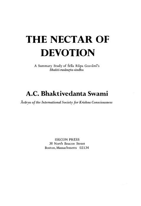
The 1970 Edition First Printing By ISKCON PRESS – Boston, MA
In 1969, Srila Prabhupada established ISKCON Press at 38 North Beacon Street in Boston. Before this, he had used commercial publishers (like Macmillan), but he wanted his disciples to handle every stage of production—from typesetting to binding.
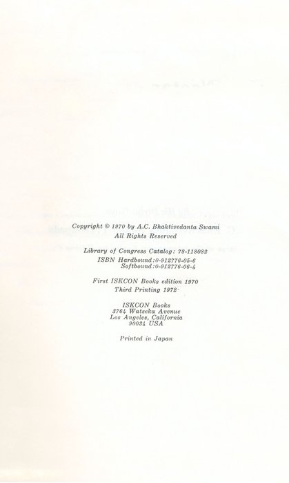
Date: The white cover edition was released in early 1970 (copyrighted 1970).
The “First” Status: It was one of the first major “big books” entirely produced by the Boston press, alongside The Teachings of Lord Chaitanya.
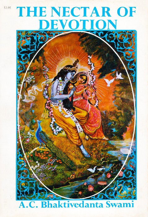
The Cover Art: The white cover features a simple, elegant design. The central image is a painting of Radha and Krishna (often the same artwork seen on the later blue edition, but set against a stark white background).
Second Printing 1971 By ISKCON PRESS – Boston, MA

The 1971 second printing of The Nectar of Devotion holds a unique place in the history of Srila Prabhupada’s publications. It marks the final chapter of the “Boston Era” before the movement’s printing operations moved to industrial facilities in Japan.
While the 1970 first edition proved that the devotees could produce a “big book,” the 1971 second printing was an attempt to refine that process.
Location: It was printed at the ISKCON Press facility in Boston (38 North Beacon Street).
Labor of Love: At this time, the “press” was not a professional factory but a collection of devoted students learning to operate offset presses, typesetters, and binding machines. Srila Prabhupada famously called the press “the heart of our movement.”
The “Twin” Project: During 1971, ISKCON Press was simultaneously endeavoring to produce The Teachings of Lord Chaitanya. These two books were the only “large-format” texts the Boston press managed to produce entirely in-house before the operation became too large for the building.
The “White Cover” Continues: Like the 1970 original, the 1971 second printing retained the white background and the central painting of Radha and Krishna.
Paperback Dominance: While the first printing had a significant hardcover run, the 1971 second printing was primarily produced as a paperback. This was done to lower the price point for “Sankirtan” (street distribution), as Prabhupada was pushing his students to get these books into the hands of the general public.
Third Printing 1972 By Dai Nippon – Tokyo, Japan
The “Dai Nippon” Trade Paperback (1972)
By late 1971, the demand for books was outstripping the capabilities of the ISKCON Press in Boston. Srila Prabhupada made the strategic decision to move production to Dai Nippon Printing Co. in Tokyo, Japan—one of the largest and most sophisticated printing houses in the world.
The BBT Era Begins: 1972 was the year Srila Prabhupada officially established the Bhaktivedanta Book Trust (BBT). The 1972 Dai Nippon edition of The Nectar Of Devotion was among the first books to carry the new BBT imprint, replacing the “ISKCON Press” label.
Mass Production: For the first time, the book was printed in tens of thousands of copies rather than a few thousand, enabling global distribution on an unprecedented scale.
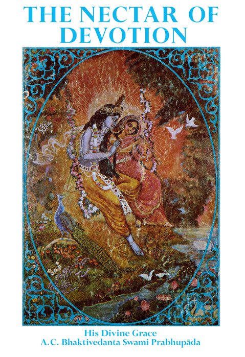
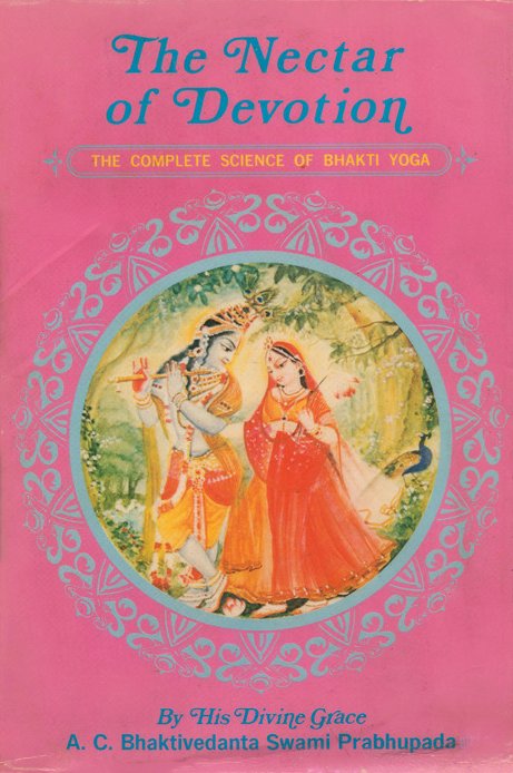
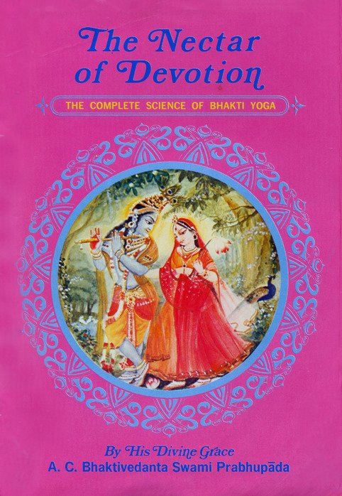
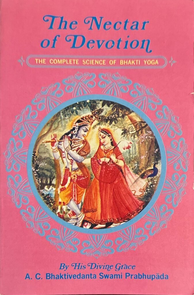
The Color Palette: The cover features a soft, pastel-to-vibrant pink background. This color was chosen to make the book look less like a “legal lawbook” and more like an inviting, spiritual “nectar.” There is a special “sweetness” to the cover!
Fourth Printing 1972 By The Bhaktivedanta Book Trust – Tokyo, Japan

The “Dai Nippon” Blue Hardback (1972)
This is the most famous version of the book. When production moved to Japan, the hardback underwent a total transformation.
The Blue Cloth: Beneath the dust jacket, the book was bound in a rich royal blue cloth with gold-leaf stamping on the spine and front cover.
The Dust Jacket: The 1972 hardback featured a full-bleed, vibrant painting of Radha and Krishna in a forest setting on a pink background. The back of the jacket often featured a photograph of Srila Prabhupada or a description of the “Science of Bhakti.”
The “Library” Standard: This edition was specifically designed to meet Library of Congress standards. Srila Prabhupada’s goal was for every major university library in the world to house this specific blue hardback.
The Bhaktivedanta Book Trust: On March 30, 1972, Srila Prabhupada formally established the Bhaktivedanta Book Trust in Bombay by a preliminary signing of the official ‘Deed of Trust.’ The blue hardback was the first printing of The Nectar Of Devotion published under the new Bhaktivedanta Book Trust name, and one of the first books published under the name at that. The Bhagavad-gita As It Is Unabridged Edition was the first book published under the BBT name in August of 1972. Letters from Srila Prabhupada around October and November of 1972 mention that the “Japan books” (which included The Nectar of Devotion and the first few cantos of Srimad-Bhagavatam) were “in the press” or “on the water” (being shipped).
No print number or year shown on the copyright page: The blue hardback printing as well as the smaller paperback printing to follow do not have the printing number or year on the copyright page; only the copyright year of 1970 for the edition in general is shown. It is estimated that the printing year is late 1972, with book shipments reaching ISKCON centers by early 1973.
Fifth Printing 1972 By The Bhaktivedanta Book Trust – Tokyo, Japan

The “Dai Nippon” Mass-market Paperback (1972)
The “small pink” edition of The Nectar of Devotion is one of the most widely recognized versions of the book, specifically engineered for the height of the global book distribution boom in the mid-1970s.
While the “Blue Hardback” was for libraries and scholars, the Mass Market Pink Paperback was designed for the “Sankirtan” devotees to carry in their bags and distribute to people on the streets, in airports, and at festivals.
Design differences between all three pink Dai Nippon printings: The only difference in design that we can detect in the artwork and layout of the covering of the books is the word-wrapping in the yellow box on the back cover of the books. The hyphenating is different on each book: a small but helpful tip for anyone wanting to distinguish between the three more easily.